
Lifepath, 2024
A mobile app prototype that is made to explore new places and activities.
Through comprehensive user research, iterative design, and usability testing, Lifepath creates an intuitive solution for discovering meaningful activities tailored to individual preferences and location.
PROBLEM & OPPORTUNITY
With isolation, technology dependence, and cases of mental health issues on the rise, there was a clear need for a solution that break the pattern of mental health apps by encouraging meaningful, physical activities. Rather than focusing on therapy or victim-shaming approaches, the opportunity was to gamify real-world experiences that naturally build social connections and combat isolation.
RESEARCH & DISCOVERY
Research Methods
I conducted a SWOT analysis and target audience interviews to validate the problem space. Competitive analysis of apps like Soluna (mental health app by Hope California) and Eventbrite revealed gaps in personalization and gamification for physical activities.
Target Audience
Ages 25-65, ranging from retired to full-time workers. Primary users are people new to an area or seeking new experiences without traveling far, who may struggle with planning activities, finding time, or need motivation to get active.
User Research Tools
Created detailed user personas, empathy maps, and analyzed user needs through Maslow's hierarchy framework. User interviews revealed key frustrations around decision fatigue, lack of personalization in existing solutions, and difficulty finding activities that match both interests and physical capabilities.
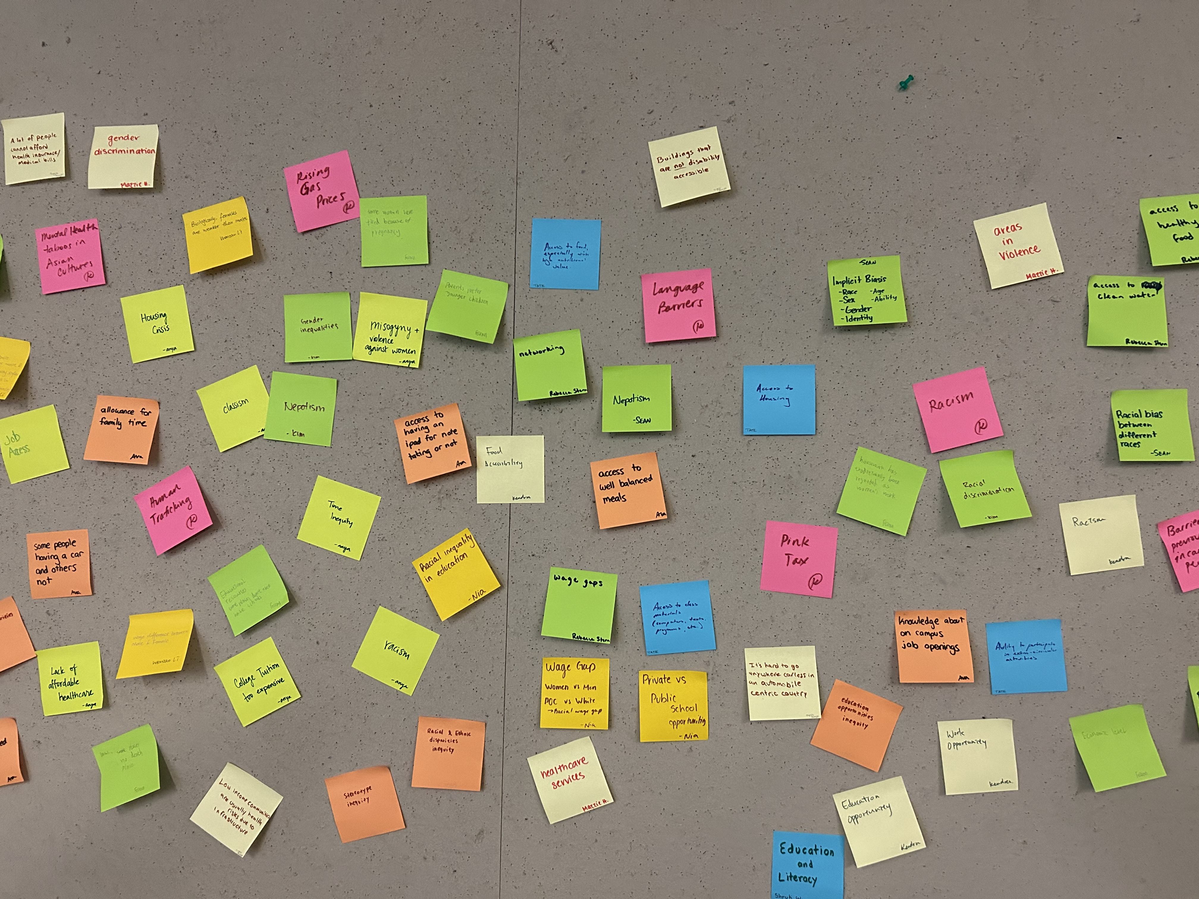
User research artifacts including empathy mapping, target audience profiles, and competitive analysis findings.
DESIGN PROCESS
User Flow Development
The core flow follows a deliberate sequence: Home Screen (customizable preferences) → Shuffle Feature → Location Selection → Time Setting → Duration → Activity Summary. This progression was designed to minimize decision fatigue while maintaining user control.
Shuffle Feature Rationale
Inspired by the iPod shuffle concept, where preferences are set in advance and the order becomes less critical. Users can navigate through activity options using left/right gestures or use the shuffle button beneath event thumbnail images.
Alternative Solutions
An interactive map interface was initially considered but rejected during testing due to visual overload and complexity. The shuffle approach proved more intuitive and less overwhelming for the target demographic.
Wireframing Process
Started with paper sketches, then translated to comprehensive Figma prototypes. Major iterations focused on UI refinement, developing a tactile feeling interface with glossy elements and skeuomorphic design principles.
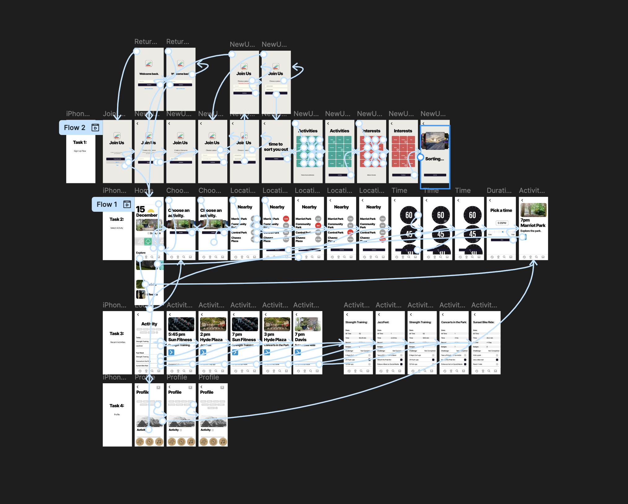
Complete user flow from onboarding through activity completion, showing the comprehensive navigation structure and decision points.
Key tools and methods:
Figma (prototyping and design system)
SWOT Analysis framework
Target audience interviews
Empathy mapping and user personas
Competitive analysis research
Paper wireframing and digital prototyping
Usability testing with target demographics
iOS Human Interface Guidelines
KEY SCREENS & USER JOURNEY
Home Screen & Personalization: The landing page provides comprehensive customization options, allowing users to select preferred activity types, set location radius, and access their profile. This front-loaded personalization ensures the shuffle feature delivers relevant, appealing options tailored to individual preferences and physical capabilities.
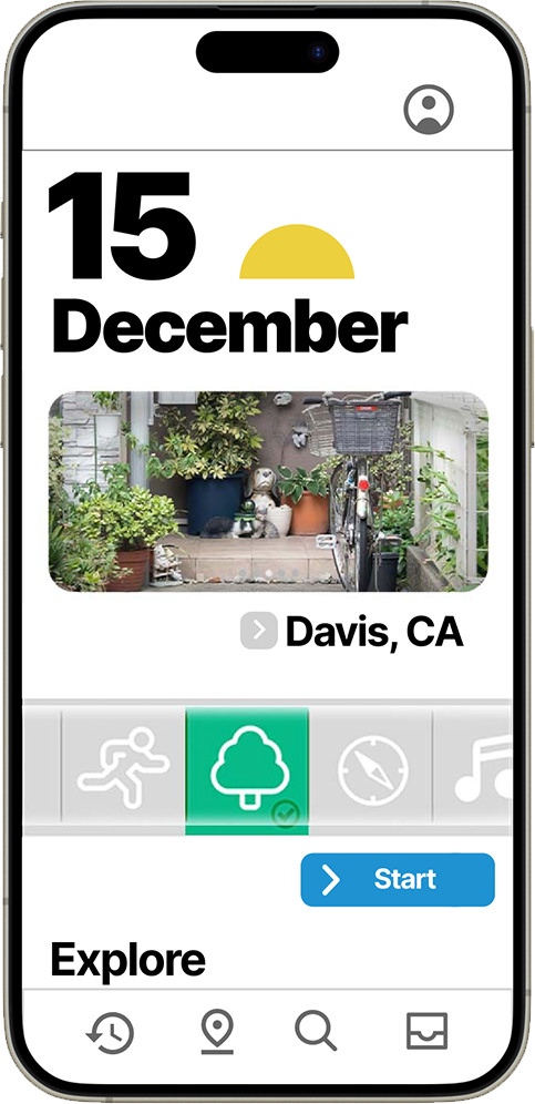
Home screen interface featuring activity type selection, location settings, and user profile access with intuitive navigation patterns.
Activity Discovery & Shuffle: The core discovery mechanism presents activities in an engaging, card-based interface. Users can swipe left/right through options or use the shuffle button to explore new possibilities. This reduces decision paralysis while maintaining the element of discovery that makes finding activities exciting rather than overwhelming.
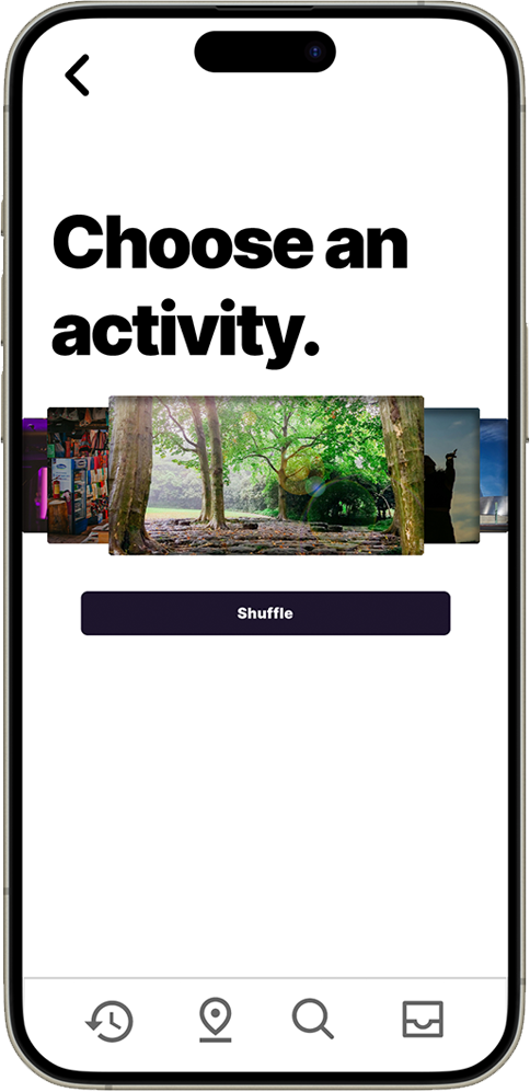
Activity shuffle interface with swipeable cards and shuffle functionality, designed to make activity discovery feel engaging and effortless.
Location Selection: When users find an appealing activity, the app presents nearby venues with clear distance indicators and relevant details. This helps users make informed decisions about travel time and venue accessibility, crucial for maintaining motivation and reducing barriers to participation.
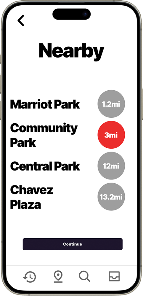
Location selection interface displaying nearby venues with distance indicators and venue details for informed decision-making.
Flexible Scheduling: The time and duration selection screens accommodate different user schedules and energy levels. The time selector helps users plan around their existing commitments, while the duration screen allows for activities ranging from quick 30-minute sessions to full-day experiences.
This flexibility is crucial for the diverse target audience (ages 25-65) with varying availability, physical capabilities, and activity preferences. The clear, large interface elements ensure accessibility across age groups.
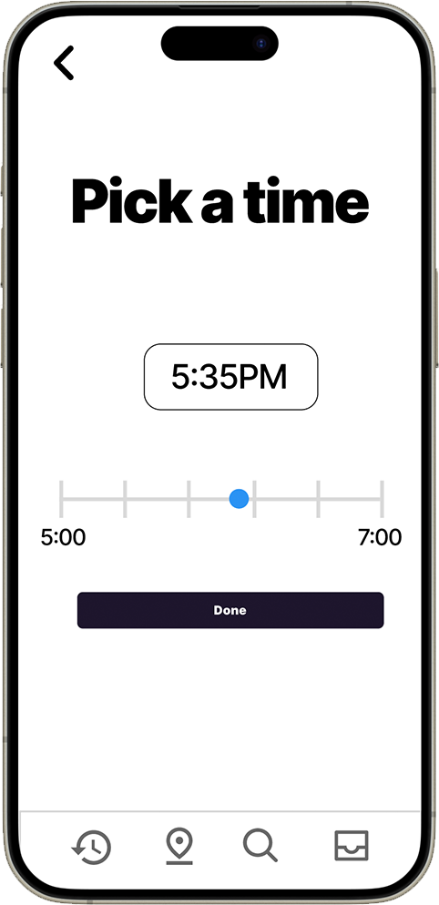
Time selection interface with intuitive time picker, designed for easy scheduling and clear visual hierarchy.
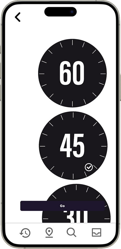
Duration selection screen allowing users to set activity length based on their available time and energy levels.
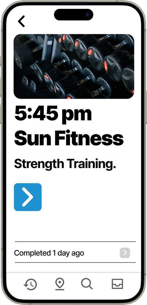
Event Confirmation & Summary: The final confirmation screen provides a comprehensive overview of the planned activity, including location details, timing, and a brief description of what to expect. This summary reduces anxiety about trying new activities and helps users feel prepared and confident about their choice.
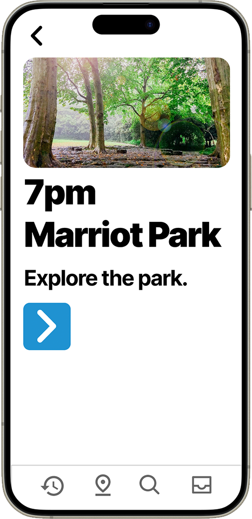
Event summary and confirmation screen providing comprehensive activity details and final confirmation before committing to the activity.
GAMIFICATION & ENGAGEMENT
Badge Collection System: Users earn sport-specific "Veteran" badges (bronze to platinum) for dedicating 100+ hours to activities like swimming. Collectible coins reward one-off event participation, encouraging users to try new experiences and maintain engagement over time.
Profile & Progress Tracking: The profile screen showcases earned badges and provides a sense of achievement and progression. This gamification approach taps into intrinsic motivation while creating a visual representation of the user's journey toward more active, social lifestyle.
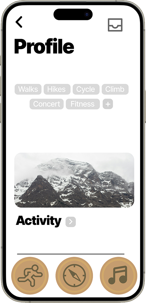
User profile interface displaying collected badges, achievements, and progression through the gamification system.
ACTIVITY TRACKING & HISTORY
Activity Management: The activity tracking system allows users to view their participation history, sort past activities, and add new events manually. This feature helps users reflect on their progress and maintain motivation by visualizing their increased activity levels and social engagement over time.
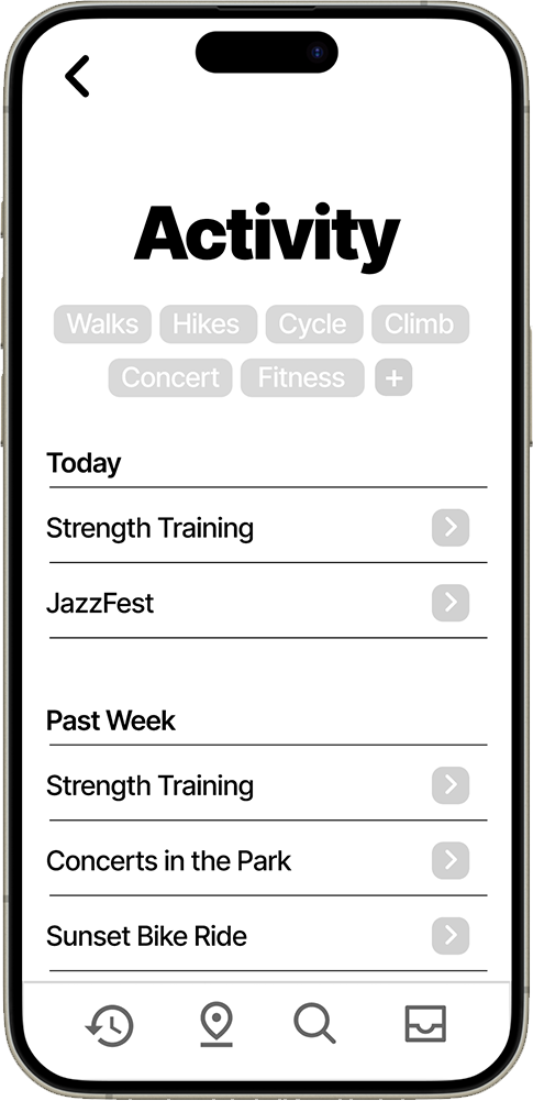
Activity history interface with recent activities list, sorting capabilities, and option to manually add activities.
Activity Details: When users select a past activity, they can review the complete details of their experience, including location, duration, and personal notes. This feature helps users identify favorite activities and venues for future planning.
Progress Analytics: The statistics screen provides insights into activity patterns, showing progression over time and highlighting achievements. This data-driven approach helps users understand their behavioral changes and maintains long-term motivation.
Detailed view of a past activity, showing comprehensive information about the completed event and user experience.
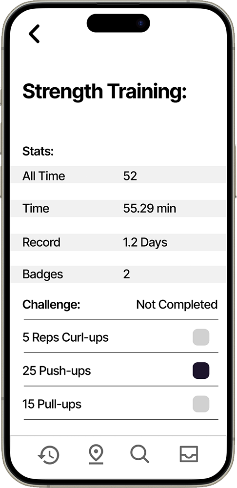
Activity statistics and progress tracking screen, providing users with insights into their participation patterns and achievements.
TESTING & VALIDATION
Usability testing was conducted with target audience members using early Figma prototypes. The primary success metric was measuring the time required for users to complete the full journey from onboarding through final event selection. Testing revealed key friction points in the original onboarding flow, leading to streamlined preference-setting and clearer visual hierarchy. Users consistently praised the shuffle concept as "refreshing" and "less overwhelming" compared to traditional list-based discovery methods.
VISUAL DESIGN & ACCESSIBILITY
The visual approach emphasizes native iOS patterns while incorporating tactile, skeuomorphic elements that feel intuitive across the 25-65 age range. Glossy UI elements and consistent interaction patterns create a cohesive experience that doesn't distract from the primary goal: encouraging outdoor activity.
Accessibility considerations included consistent button sizing, readable font hierarchies, and predictable navigation patterns. The design deliberately avoids clinical or therapy-focused aesthetics, instead feeling motivational and approachable to reduce barriers to engagement.
IMPACT & OUTCOMES
The prototype successfully addresses the core problem of social isolation through a gamified approach that feels engaging rather than prescriptive. The shuffle mechanic reduces decision paralysis while the badge system provides long-term motivation for continued engagement.
User testing validated that the app appeals to diverse age groups and activity levels, with particular success among users who struggle with traditional event discovery methods. The focus on physical activities and social connection creates natural opportunities for community building.
REFLECTION & NEXT STEPS
This project demonstrates how thoughtful UX research and iterative design can address complex social issues through technology. The success of the shuffle concept and gamification elements suggests opportunities for expansion into additional wellness categories. Future iterations would benefit from integration with wearable devices for activity tracking and enhanced social features for connecting users with similar interests.
Links
View the interactive Figma prototype
Complete case study documentation
Lamp, 2024
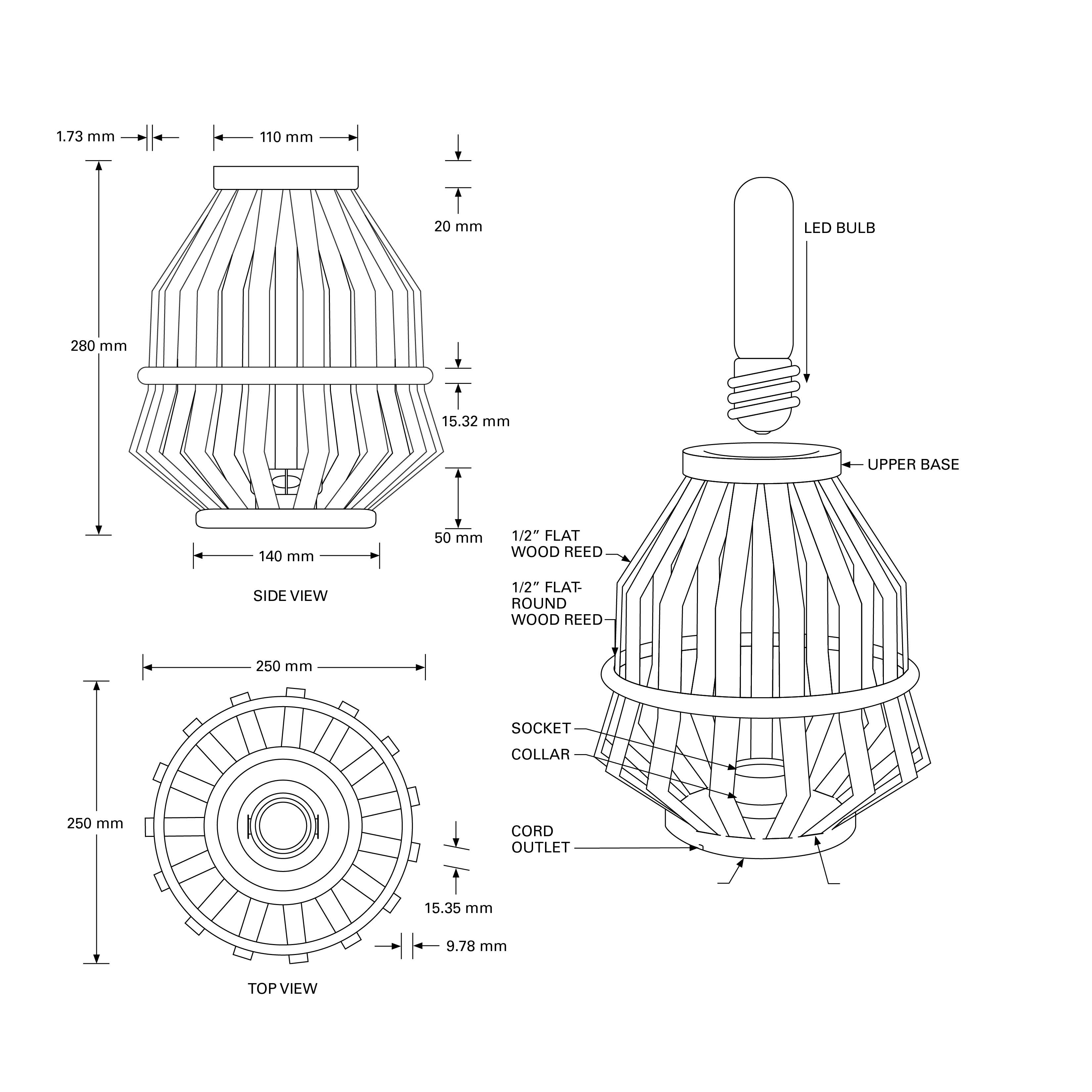
A functional, full-scale lamp, assembled using flat reed, rice paper, and 3D-printed components.
Created using both digital fabrication tools and handcraft techniques. The lamp celebrates the tradition of ceramic vessels through its form while pushing material boundaries through 3D printing and laser cutting.
Initially inspired by everday shapes, the lamp was heavily inspired by the rigid construction of bicycle wheels. More depth for the concept was drawn from the silhouette and construction methods of clay pottery and japanese paper lanterns. A major obstacle too place at the intersection between practical and digital prototyping, where I was navigating the real-world constraints of available materials and fabrication tools, while simultaneously testing durability and feasibility. The lamp was designed to be produced again and again, the simple construction creates aesthetically minimal visual, while emitting a distinctive light ray pattern. The prototype was featured in the Cruess Collective exhibit which was put together by the UC Davis Design Museum as a senior show.
This lamp was created as the craft light assignment for the Studio Practices in Industrial Design course, instructed by professor Beth Ferguson while an undergraduate UC Davis. The assignment was to find a way combine wood reed with a 3D printed component. Using the 3D printers, laser cutters, and the woodshop available at Cruess hall; the lamp tooks a couple weeks of planning, prototyping, construction.
Key materials included:
Wood wreath (flat and flat-round reed)
LED bulb and socket
Laser-cut wood (1/8" panel)
3D printer with PLA filament
Rice paper
Glue and rope
Digital calipers
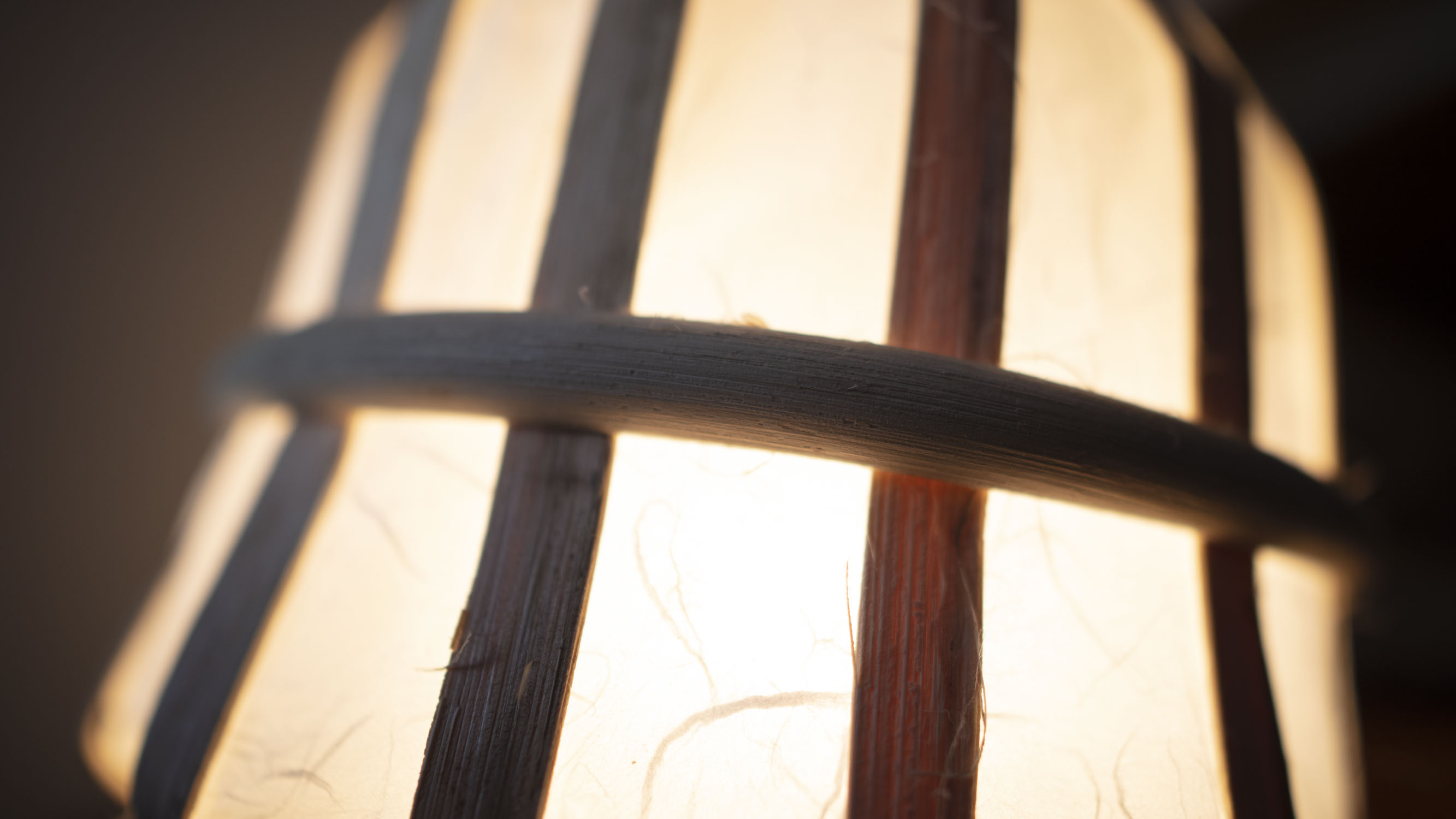
At its very core, this was an exploration in line and form. The visual design began with loose sketches exploring different lamp silhouettes, gradually simplified into a refined concept with a dual-base structure. The top and bottom 3D-printed bases serve as anchor points for the wooden reed, which forms the outer skeletal structure.
This structure supports rice paper panels, allowing light to softly diffuse through the form. Each iteration of sketching narrowed down the form to improve stability, symmetry, and material feasibility.
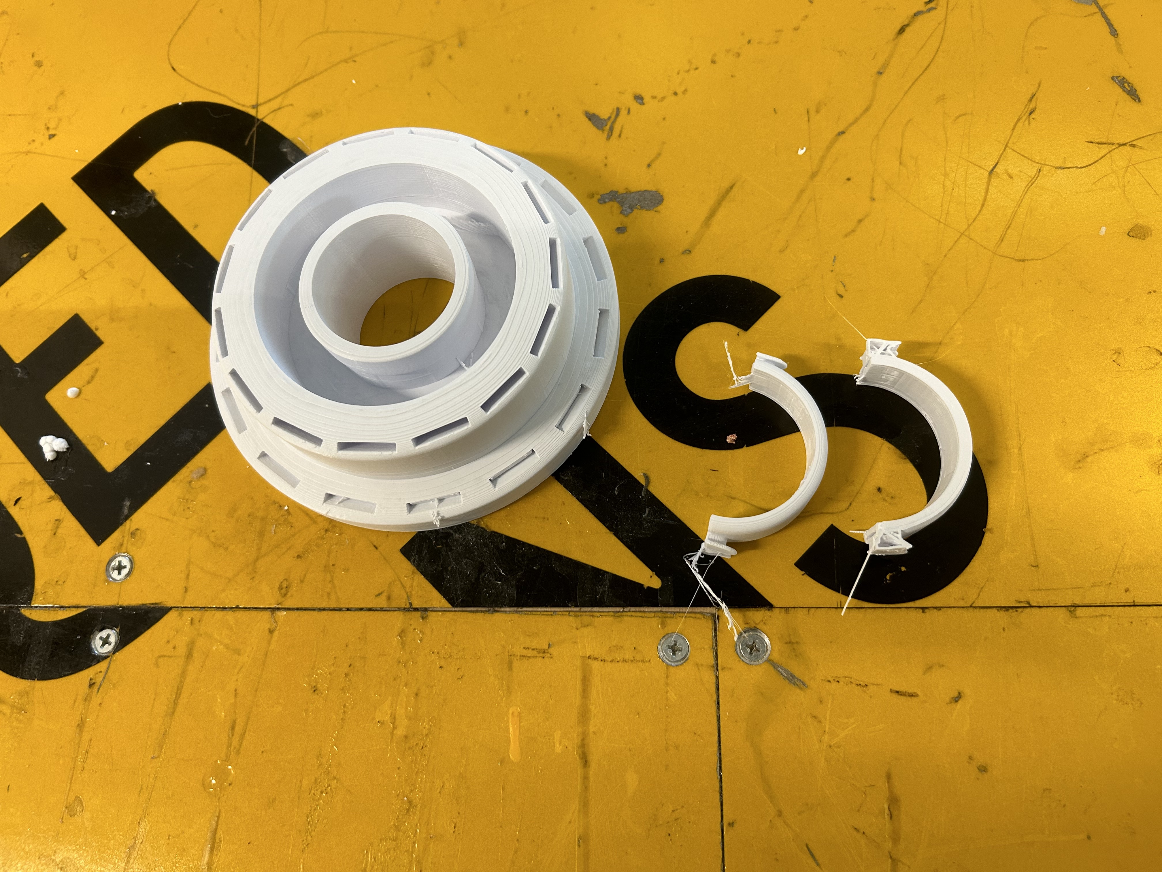
A single mold was created using a laser-cut vector path to shape the wood reed, which was soaked and formed into repeated elements. This repetition ensured interchangeable parts and efficient prototyping. 3D modeling in Rhino 8 allowed full-scale digital prototyping, serving as the blueprint for all printed components. Special care was taken to balance print time, material durability, and project deadlines.
A light switch is embedded along the power cord, enabling simple and intuitive interaction. The socket was secured into the lower base using a 3D-printed clamp and rope, with wiring fed cleanly through a channel in the bottom piece. The design focused on accessibility and ease of use, without disrupting the visual harmony of the lamp's form.
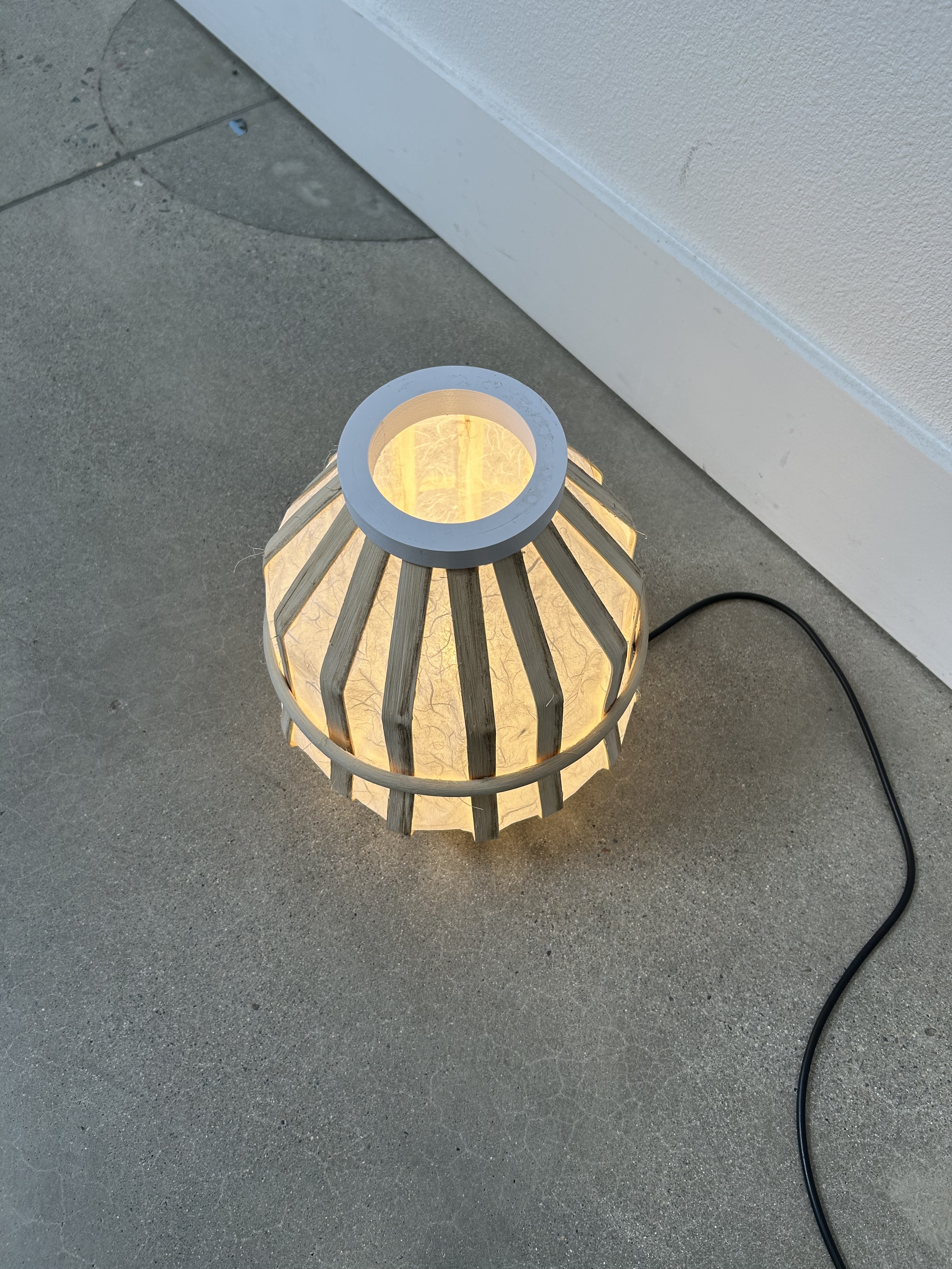
OUTCOME
Assembling the lamp was a blend of precision and craft. Each reed insert was tested for fit using printed variations, ensuring the structure remained symmetrical and stable. Once fitted, reeds were glued into place, forming the main cage-like silhouette. Rice paper was traced and cut using a custom mold to fit between the wooden slats, creating 15 individual panels.
These panels completed the lantern-style body. Final print time was calculated at 6 hours and 40 minutes, with added support for curved features and reinforced infill in the clamps for extra durability. The result is a warm, diffused light source that feels both modern and grounded in traditional craft sensibilities.
SUMMARY
This lamp project serves as a case study in harmonizing traditional design languages with modern prototyping technologies. By drawing on the heritage of clay pottery and reinterpreting it through digital modeling, laser cutting, and 3D printing, the final object demonstrates how organic form and function can coexist in contemporary design. The use of natural materials like wood reed and rice paper alongside PLA plastic embodies a thoughtful exploration of materials, unlikely construction elements working together to create a cohesive, functional light fixture form scratch.
Links
Featured in this UC Davis article mentioning the Design Museum's Cruess Collective.
PFAS: Explained, 2024
A motion graphic short film, made using digital animation, illustration, and infographic design.
Created using both illustration and motion design tools, the piece educates audiences on the presence and risks of PFAs, commonly known as "Forever Chemicals." It balances complex messaging with urgency, communicating through an engaging and visually compelling experience.
The primary conceptual inspiration was drawn from public health PSAs and environmental advocacy campaigns. This was the final project for the Type In Motion at UC Davis, taught by March Ishisaka-Nolfi. This course was my first introduction into animation and After Effects, it was challenging but instinctual because animating graphics is great tool to have as a designer. The animation emulates the tone of educational media while introducing a visual language inspired by household packaging and lifestyle products: which ironically are the very sources of PFAs contamination. The project's central challenge was translating dense scientific research into a digestible visual narrative, without oversimplifying or sensationalizing the issue.
Key materials included:
Adobe After Effects (for animation and motion design)
Adobe Illustrator (for vector asset creation)
Backing track music
Data sources from the CDC, EPA, and BBC
Custom iconography and infographics
Scriptwriting and storyboarding tools
Research-backed statistical visuals
The visual design process began with a series of sketches and moodboards referencing consumer packaging, health campaign aesthetics, and data visualization styles. Storyboarding was used to break down the flow into five primary sections: Introduction, Exposure, Health Risks, and Ways to minimize your exposure.
The motion graphic combines flat illustration with stylized, animated infographic styles—bar charts, symbolic diagrams, molecule breakdowns, and visual metaphors (e.g., asteriks, corporate-style graphics, and anatomical diagrams) to demonstrate risk and scale to people. The design goal was to make invisible contaminants feel visible and real.
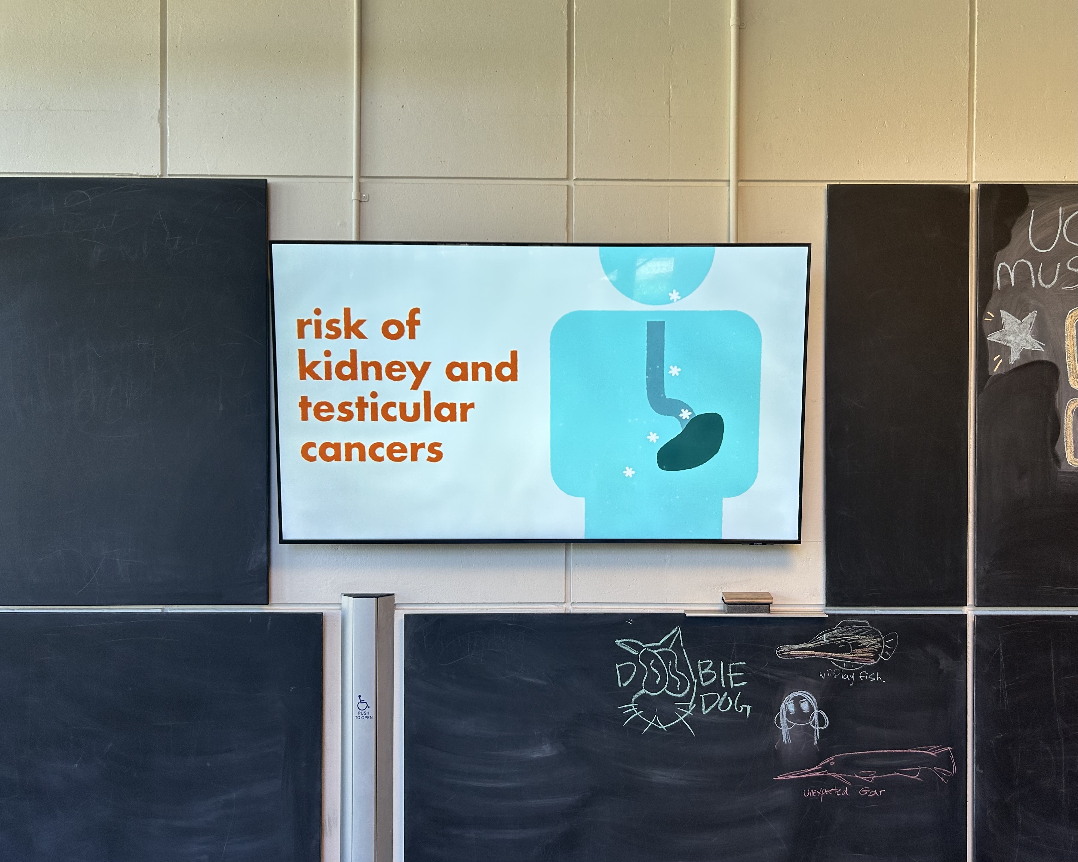
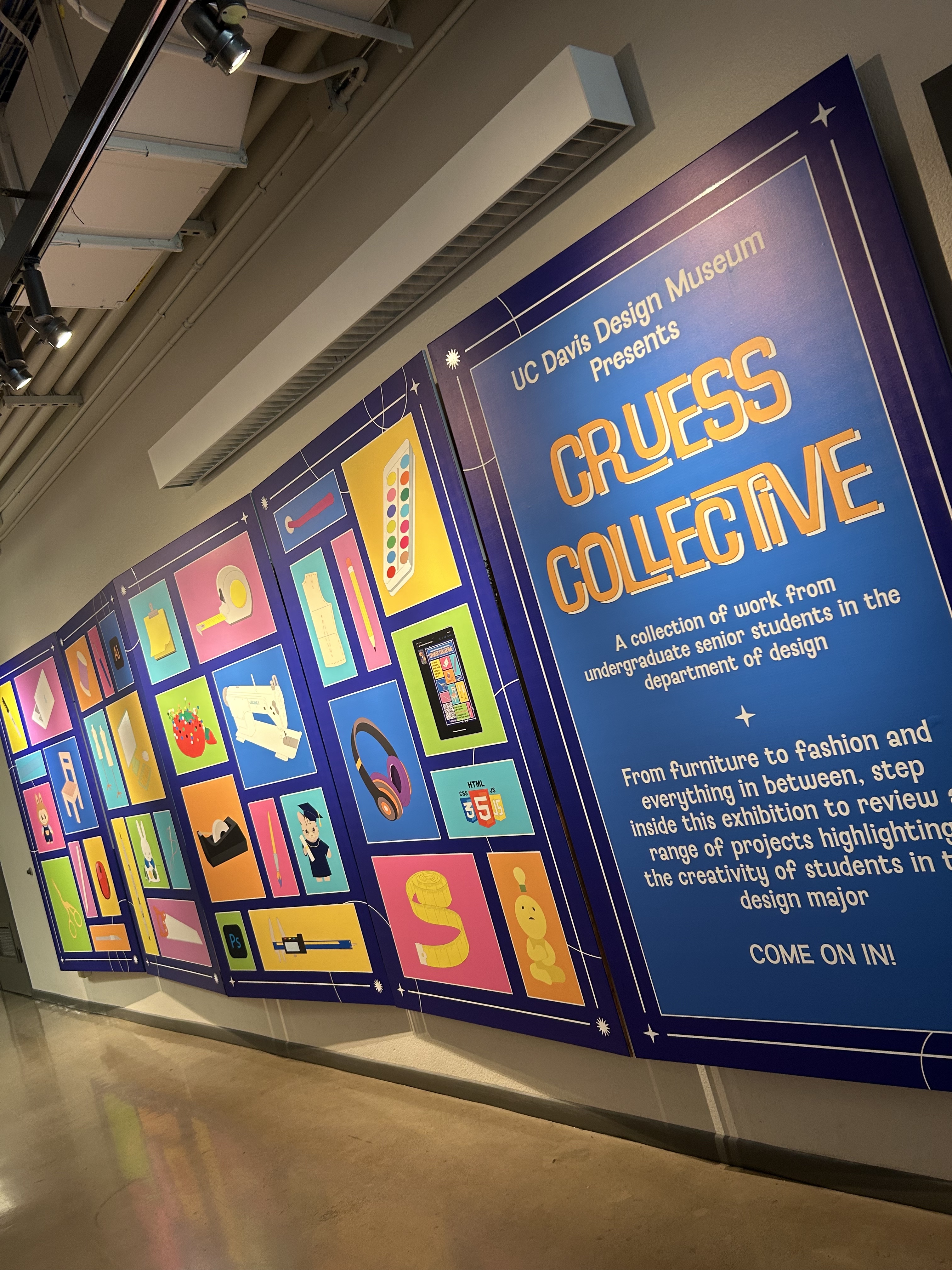
PFAs: Explained on display at the Cruess Collective exhibit curated by the UC Davis Design Museum, as a part of the senior show. Davis. 2025.
The experience is linear and narrative-driven, guiding the viewer from curiosity to concern to action. The animated text supports the tone, educational yet conversational, making sure viewers of all backgrounds can follow along. Bright but muted color palettes were chosen to reflect household familiarity while reinforcing the subtle danger. Accessibility was prioritized through animation speed of the on-screen text, and intentionally pauses that let audiences absorb the points made. Each scene is designed with a dual layer: which is surface-level understanding for casual viewers, but at a deeper level The project mimmics a corporate, cold feeling, which is a nod to the real issues.
OUTCOME
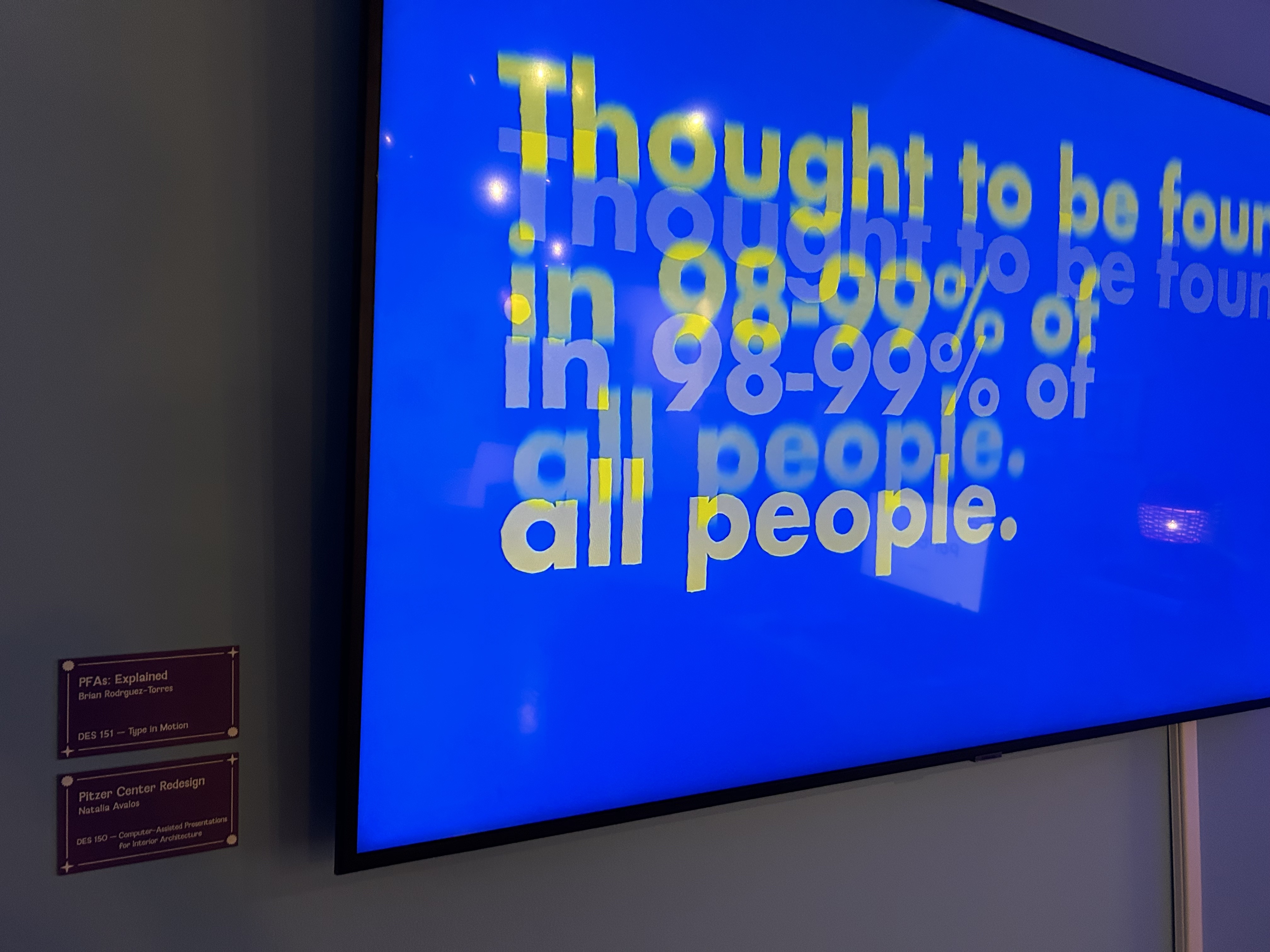
The finished motion graphic runs approximately 2 minutes and 30 seconds. It compresses extensive research into a focused message: PFAs are everywhere, and everyone is affected... but we still have choices.
The film avoids fear-mongering in favor of empowerment. The tone remains urgent but constructive, culminating in practical tips: Look for "PFAS-Free" and "Toxic-Free" labels,Avoid products with "fluoro-" ingredients, Use water filters where possible.
SUMMARY
While this motion graphic project was created as coursework, it serves as a case study in using design for public health advocacy. By visualizing the hidden risks of PFAs, chemicals found in 98–99% of Americans, I visualized a gap between complex data and everyday decisions which can increase expsosure to a potentially hazardous substance. The piece encourages reflection, inspires action, and pushes for industry and legislative accountability. It highlights how invisible threats embedded in convenience culture can be seen, understood, and ultimately challenged through informed design.
Links
Featured in the UC Davis Design Museum's Cruess Collective
YouTube
Lecture 1100, 2025
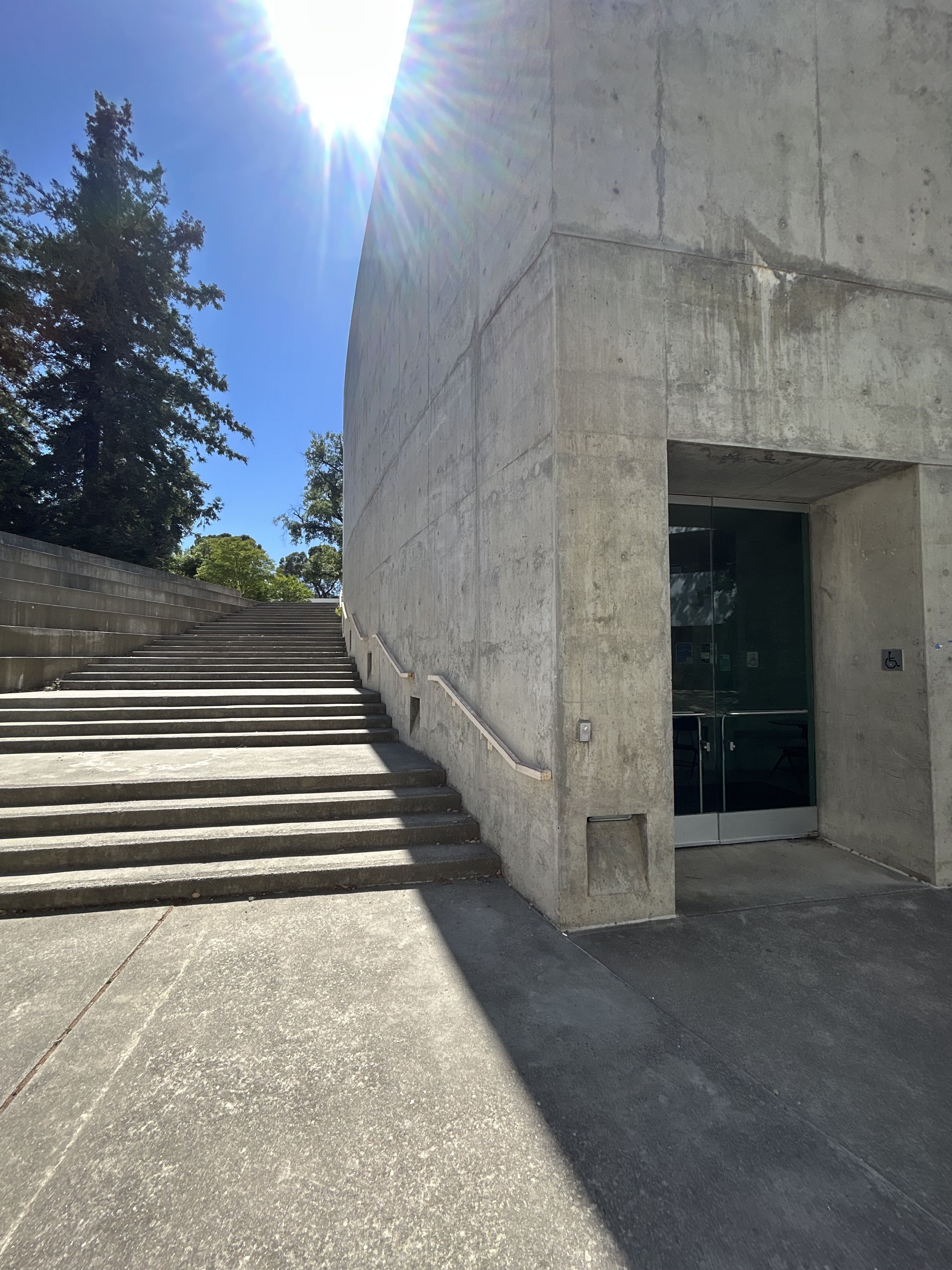
A full-scale digital reimagining of a brutalist lecture hall lobby, created through precise surveying, 3D modeling, and visual storytelling.
Developed through Rhino-based field measurements, a 2D survey was created in order to make a 3D translation, and Twinmotion rendering, this project brings new life to a university lobby by blending brutalist structure with futuristic, organic interior interventions.
The project began by taking a 1:1 site survey of Lecture Hall 1100 Lobby, which was for the DES 150 - CAD Presentations for Interior Architecture course, taught by Joe Pierre at UC Davis. Situated within a concrete brutalist structure located in the Natural Sciences & Humanities building at UC Davis, locally known as the "Deathstar". The space, while architecturally striking, was underutilized and visually cold. Inspired by combining the natural rhythms of surrounding plains and farmland, with the advanced research within the sciences hall, the redesign sought to bridge material honesty with softer, flowing forms, ultimately melding brutalism with biomimicry. The guiding concept was transformative: recreating a rigid, monolithic space and then reinterpreting it with warmth, movement, and human-centered design.
Key elements included:
Rhino 8 (precise laser-scan-based survey modeling)
Twinmotion (real-time visualization and rendering)
Leica Laser Distance Measurer
Custom-designed 3D assets (desk surfaces, wall facade, ceiling sculpture)
Natural wood textures and lighting assets
Organic form references from geological and environmental flows
The design process began with an on-site visit and laser-assisted measurements to capture the existing brutalist geometry of Lecture Hall 110 Lobby. Using Rhino, a 2D survey drawing was developed based on exact proportions and spatial relationships. From this, a 3D model was constructed to recreate the original concrete structure with high accuracy.
The initial modeling phase emphasized on created an accurate model, created in Rhino. This space, void of decór, served as the perfect blank canvas to design for. Leveraging tools like Twinmotion meant I could take my 3D survey and create a life-like interpretation of it, then ultimately remodel it.
The re-envisioning phase explored ways to soften and enrich the space through natural materials and futuristic design cues. A sculptural ceiling element was introduced: a flowing light fixture inspired by the rolling golden plains surrounding the campus. This form was generated through parametric modeling and designed to appear as if sintered by wind, gravity, and wave patterns, bringing a sense of organic motion to the rigid ceiling plane. The walls were augmented with a layered wood facade to introduce warmth and material variation, echoing the textures of natural landscapes while providing better acoustics. Custom desks were added to create more intentional zones for work and study, featuring organically shaped tabletops that support both function and movement. These forms reject traditional symmetry in favor of a fluid ergonomics that align with the lobby's conceptual flow. Each design choice was made to align with the function of the building, which is rooted in natural sciences and humanities; merging architectural presence with environmental inspiration.
The reimagined lobby is designed not just to be seen, but to be felt. The Twinmotion video rendering guides viewers through the transformed space, showcasing how light, texture, and form work together to reshape the atmosphere. The harshness of concrete is tempered by the natural rhythm of the ceiling sculpture, which undulates softly above visitors, casting dappled light and shadow across the floor throughout the day, and plenty of unique relfections and lighting effects. The wooden wall panels add tactile depth, giving the room a grounded, human scale. The lighting design enhances this sense of calm, blending ambient warmth with targeted highlights on furniture surfaces and wall planes. Each detail created from the curved lines of the desks to the integrated lighting system, is meant to encourage presence and reflection, rather than mere passage. Ultimately, the experience is immersive and aspirational. It invites students and faculty to pause, linger, and engage. The redesigned lobby becomes more than a circulation zone; it becomes a place to inhabit – one that celebrates both the integrity of its brutalist origins and the evolving ethos of a science-driven, future-facing university.
OUTCOME
The final deliverable is a fully rendered spatial visualization that transforms Lecture Hall 110 Lobby into a functional, future-ready environment. By starting with precise on-site surveying and translating those measurements into a 3D Rhino model, the project demonstrates the ability to accurately document existing architecture and develop site-specific design solutions. Through Twinmotion, the space was brought to life in a high-quality video rendering, allowing clients, stakeholders, and collaborators to clearly visualize the proposed transformation before construction.
This approach highlights not only technical skill in digital modeling and rendering, but also the ability to interpret architectural context and introduce meaningful, human-centered enhancements. The reimagined lobby offers a strong example of how brutalist structures can be revitalized with warmth, movement, and modern functionality. For future clients, this project showcases surveying, spatial reprogramming, and delivering compelling visual narratives that could support informed decision-making and designs aligned with institutional identity.
SUMMARY
This project is a case study in architectural reinterpretation, combining field-based survey data with digital reimagination. Through Rhino modeling and Twinmotion rendering, the brutalist Lecture Hall 110 Lobby was transformed from static concrete mass into an expressive, human-centered space. With a rooftop sculpture echoing wind-swept plains, wood-paneled walls, and custom-designed furniture, the new lobby embraces both science and spirit: it's functional, futuristic, and deeply connected to place.
VOTE, 2020
A civic poster series designed to inspire action through art, rooted in community identity and spanning two pivotal elections
Created for a local get-out-the-vote campaign hosted by Uptown Studio, The #DRINKTHISANDVOTE posters are an ongoing project that blends civic urgency with personal expression. The work was printed, displayed, and distributed across Sacramento in election years 2020 and 2024, using a familiar landmark; the Tower Bridge, representing interconnectedness, perspective, and power.
This project stems from a belief that visual language can power social change. Developed during the emotionally charged election years of 2020 and 2024, the posters serve as a quiet but firm call to action. With the divisive nature of politics today, remaining engaged in civil discourse is essential for democracy even when the future feels uncertain. The posters, are just meant to inspire hope, whether they justturn heads or actually get someone to the ballots. These posters argue for the power of doing the least possible to shape the future, and getting people to the ballots is sometimes half the battle. The act of voting becomes an expression of hope, it's how communities are built, regardless of the winner or loser.
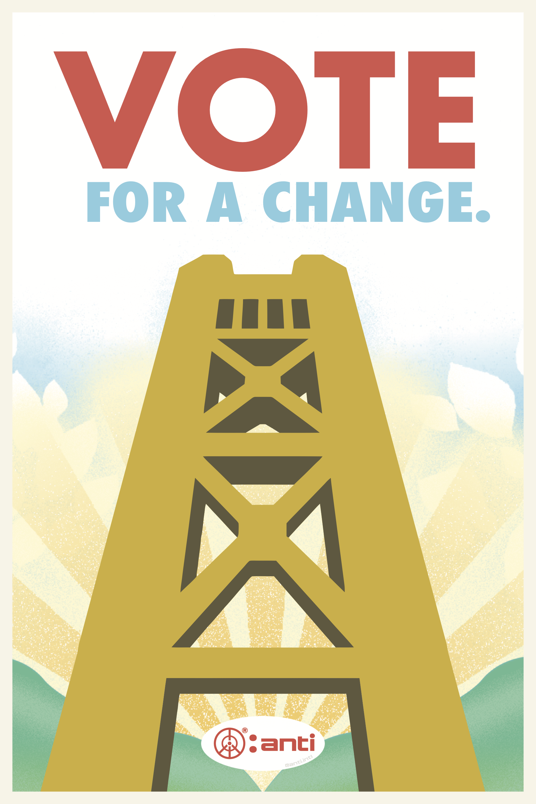
The 2020 poster features a radiating sunrise against rolling hills, which represent the levees around Sacramento. It was meant to be hopeful, a call for a new beginning. The greens in the foreground of the composition give a feeling of renewal, of things growing, beginnings, and of potential. Set against the bridge which is a bright golden hue, the contrast evokes optimism. The red "VOTE" lettering stands in stark opposition to the abstract shapes, acting as both an anchor and a clear call to action, "For A Change", imply that people who really don't typically vote, really need to now.
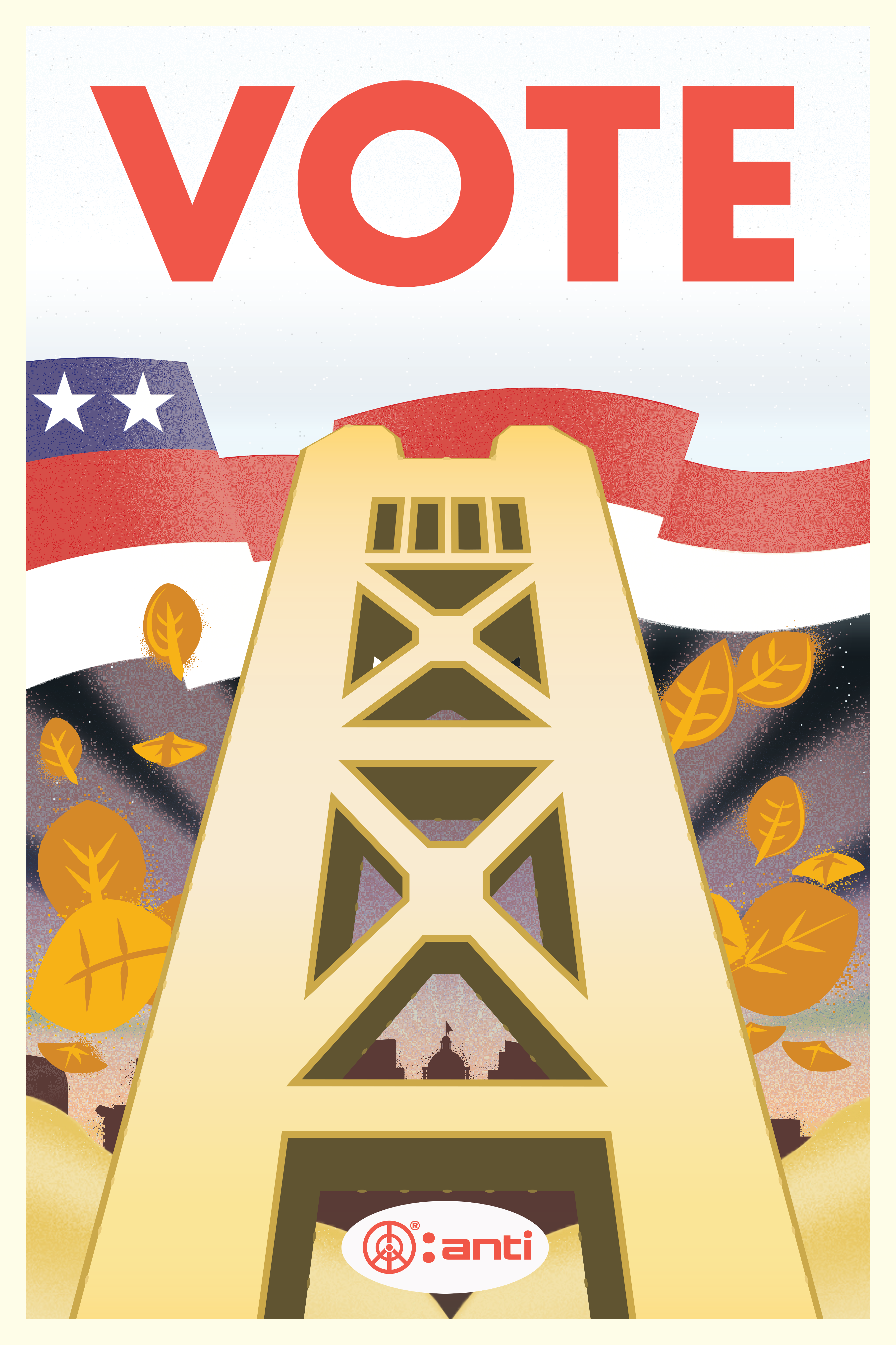
The 2024 poster, by contrast, leans into complexity and layered emotion. Its sky transitions from purples to dusky pinks and soft, fading yellows: a visual reflection of maturity as this suggests a passage of time. The bridge remains golden, but now it is silhouetted against a richer, more nuanced sky. Behind the bridge are the U.S. flag colors and two stars. There is no subtitle this time; instead, the emotional tone is communicated purely through color, structure, and contrast. The bold red "VOTE", stands alone this time, but it now floats in the reality of November voting season, amongst warm, falling leaves.
Both posters are designed to inspire hope and engagement, through two different approaches, but the posters were actually part of a wider street-level campaign pasted up all across Sacramento. Their presence in the public realm made them more real, not just in the screen, they became civic reminders. Locals encountered them during daily routines, aimed to transcend partisanship and speak to a shared sense of civic duty. By grounding the messaging through a familiar landmark and embracing a restrained but powerful visual voice, the posters fostered inclusivity and belonging. The work doesn't shout, instead it stands firm as a subtle reminder to do your part.
OUTCOME
The final deliverable for the #DRINKTHISANDVOTE project was a 12x16-inch poster, printed locally, and distributed throughout the community in collaboration with the Uptown Studios. Copies were displayed in storefront windows, cafés, corner stores, and all around town.
What made the project especially meaningful was the role of the community in its distribution. Volunteers, neighbors, and local business owners helped post and share the work, turning a single printed object into a collective sense of activism.
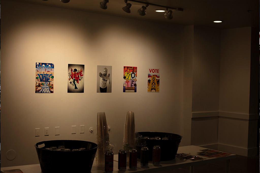
The 2024 Vote Poster displayed at Faith J. Mckinney Gallery for the the Vote Poster Art Exhibit, curated by Faith J. Mcinney and Uptown Studios, Sacramento. 2024.
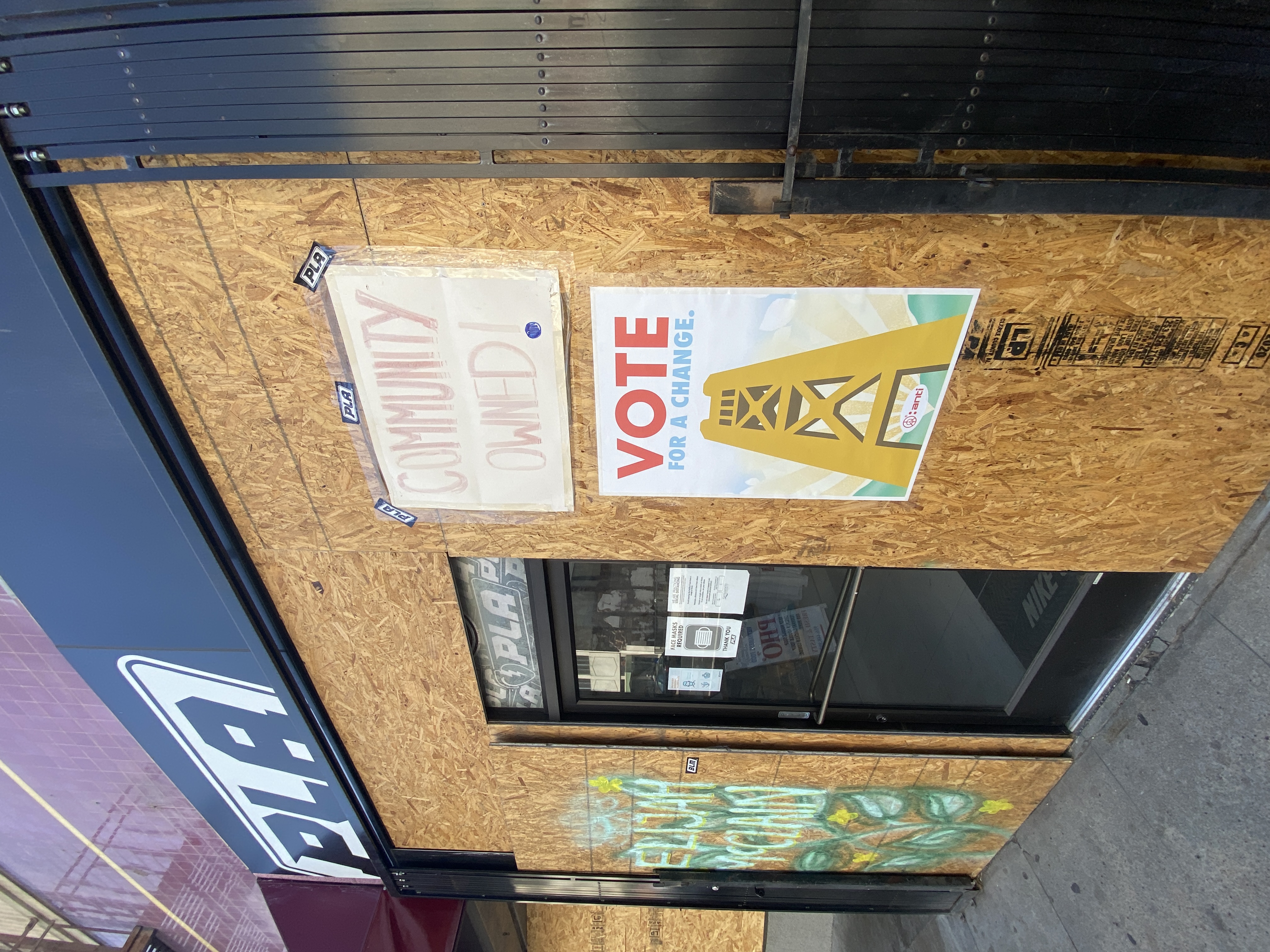
Local business owners and community members stepped in to help display posters on the streets around town. J street, Sacramento. 2020.
SUMMARY
The #DRINKTHISANDVOTE poster reflects a core value of the studio: using design to empower voices for the good. While the message focuses on voting, the project is underscored by a broader commitment to community well-being and anti-violence. In a time when polarization often dominates public discourse, this work aims to bridge differences through quiet visual strength, connecting art, place, and purpose through a single design.